- IQ Test
- All Tests
- IQ Practice Test
- IQ Challenges
- Result Sample
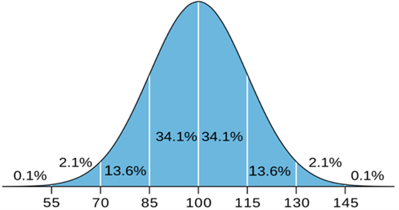
The IQ bell curve is a visual representation of how intelligence scores are distributed across a population. It shows that most people cluster around the average IQ score, with fewer individuals scoring significantly higher or lower. This bell-shaped curve illustrates the normal distribution of intelligence, where the majority falls within a standard deviation of the mean.
The IQ Bell Curve (or IQ distribution curve/IQ curve) represents the distribution of IQ scores across a population, following the principles of a normal distribution. This curve, also known as a Gaussian or normal distribution curve, is a symmetrical, bell-shaped graph with scores distributed around a central mean. In IQ testing, the mean score is typically set at 100, with a standard deviation of 15. This structure allows for consistent comparison across IQ assessments.
The IQ score distribution is presented by the bell curve because it reflects a normal distribution of cognitive abilities across a large population. This statistical model is widely applicable in natural and social sciences to represent traits or characteristics, like height, weight, or intelligence, where most individuals fall around an average value, and fewer individuals are found at the extremes.
It can be said that using the bell curve chart is a perfect way to express how the IQ scores are distributed.
Human intelligence, like many other traits, follows a natural variation pattern where most people exhibit abilities around an average level. The bell curve illustrates this, showing that average intelligence levels are common, while very high or low scores are relatively rare.
IQ tests are designed with a mean score of 100 to represent average intelligence. The bell curve centers on this mean, making it easy to compare individuals' scores relative to the average population. This helps in understanding where someone's intelligence stands relative to the broader population.
The standard deviation of 15 points in IQ scores indicates how much individuals' scores tend to deviate from the mean. The bell curve allows for predictions about the distribution of scores within the population: about 68% of people score within one standard deviation (85 to 115), and 95% score within two standard deviations (70 to 130). This helps to set clear benchmarks for what’s considered average, above average, or below average intelligence.
The bell curve’s tails, which gradually taper off, represent the rarity of extreme scores. Individuals with exceptionally high or low IQ scores fall into these tails, accounting for only a small percentage of the population (about 2.5% for scores above 130 or below 70). This distribution emphasizes how uncommon extreme scores are, allowing educators, psychologists, and policymakers to focus resources and support accordingly.
IQ tests are designed to be comparable across different groups and over time. Using the bell curve, researchers and psychologists can examine shifts in population intelligence or make comparisons across demographics with a consistent model. It provides a standardized framework for understanding and interpreting IQ results.

The IQ score distribution is presented by the bell curve.
The bell curve classifies IQ scores into specific categories, reflecting different levels of cognitive ability based on how far each score deviates from the mean of 100. The categories are typically defined by standard deviations, helping to distinguish between average, below-average, and above-average intelligence levels. Here’s a breakdown of common IQ score classifications on the bell curve:
This classification system, based on the bell curve, provides a standardized way to interpret IQ scores, enabling psychologists, educators, and researchers to identify typical categories across populations.
Understanding this distribution helps clarify patterns in educational needs, workforce potential, and social policies. Here are some of the main implications:
IQ tests assess a limited range of cognitive skills including – rational thinking, knowledge of language, and short-term memory that maps with scholastic and other problem-solving domains. This makes the IQ bell curve very good in depicting how people stand in these areas.
The theory of intelligence refers to more than creativity, emotional and practical intelligence, and other related skills not captured by an IQ scale. As a consequence, the bell curve is a right conception of scores for tested intelligences but it is not a portrayal of all the varieties of intelligence in people.
An important criticism that has been leveled against IQ tests is that they ‘re culturally and socio-economically biased. The test questions themselves are often a mirror of the creators, which leaves a disadvantage to the candidate from a different background or who did not get exposed to the test’s cultural background..
While IQ tests are standardized across different age groups, certain life experiences and aging effects influence cognitive abilities. This makes the IQ bell curve a less accurate measure for certain groups, such as very young children or the elderly, who may require more specialized assessments.
To summarize, the IQ scale is the normal distribution curve which indicates the distribution of intelligence in a particular population. However, it is necessary to remember the differentiated perception of human capabilities.